Solution
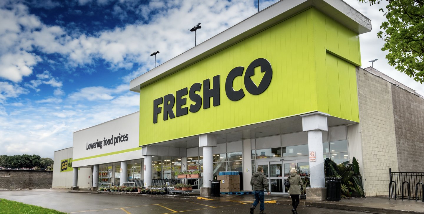
To ensure savvy shoppers were crystal clear that Freshco was a discount grocer, Fish reimagined the brand and the store experience to align with how consumers perceive the category.
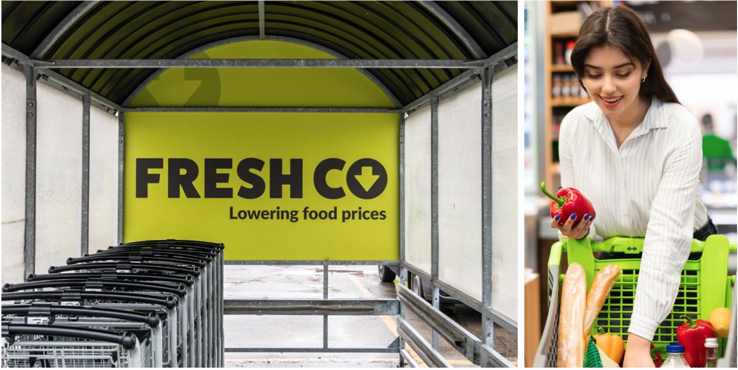
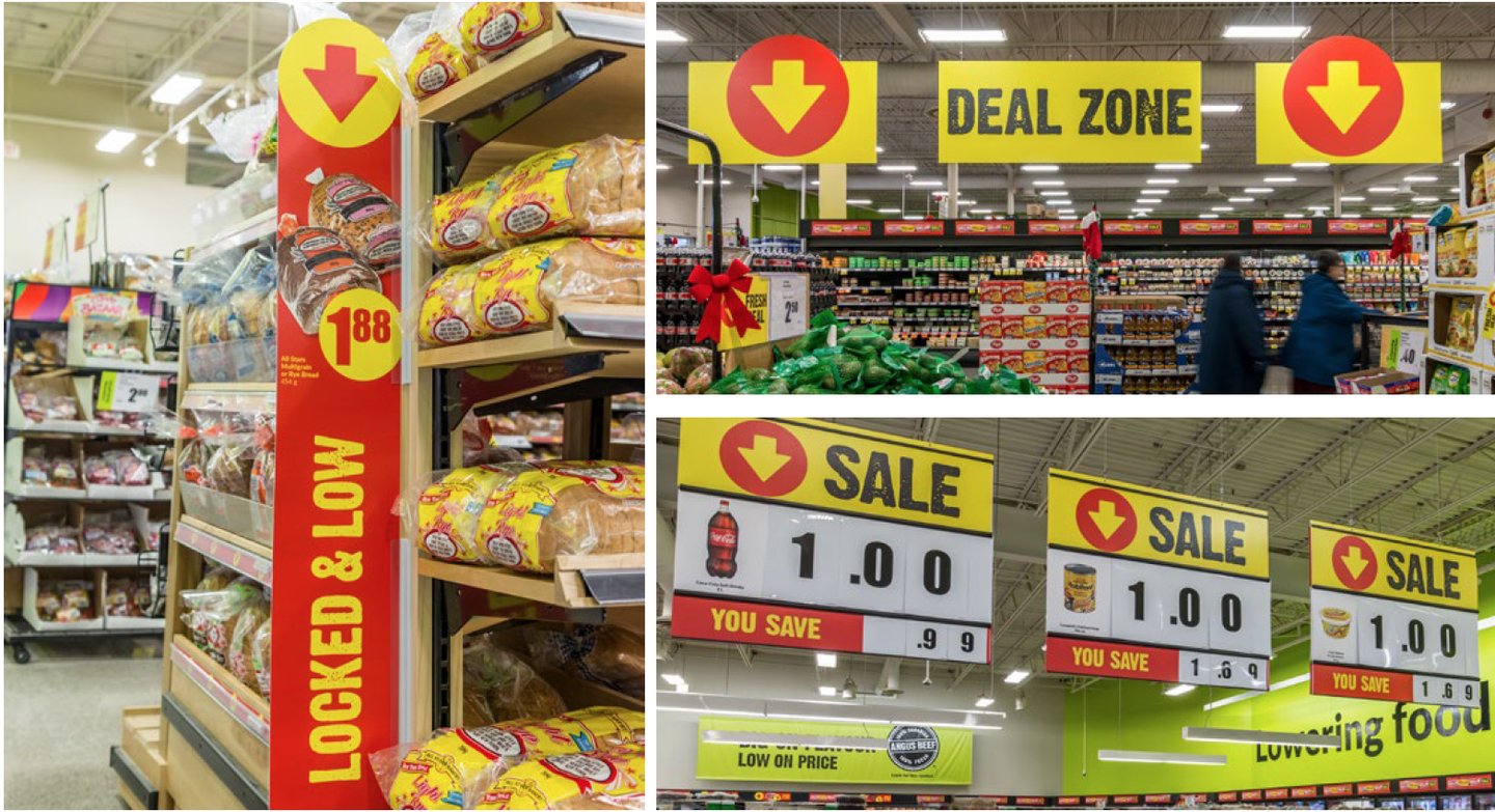
This began by redesigning the brand logo to with chunky type, deemphasizing ‘fresh’ and implying low prices with a downward pointing arrow icon.
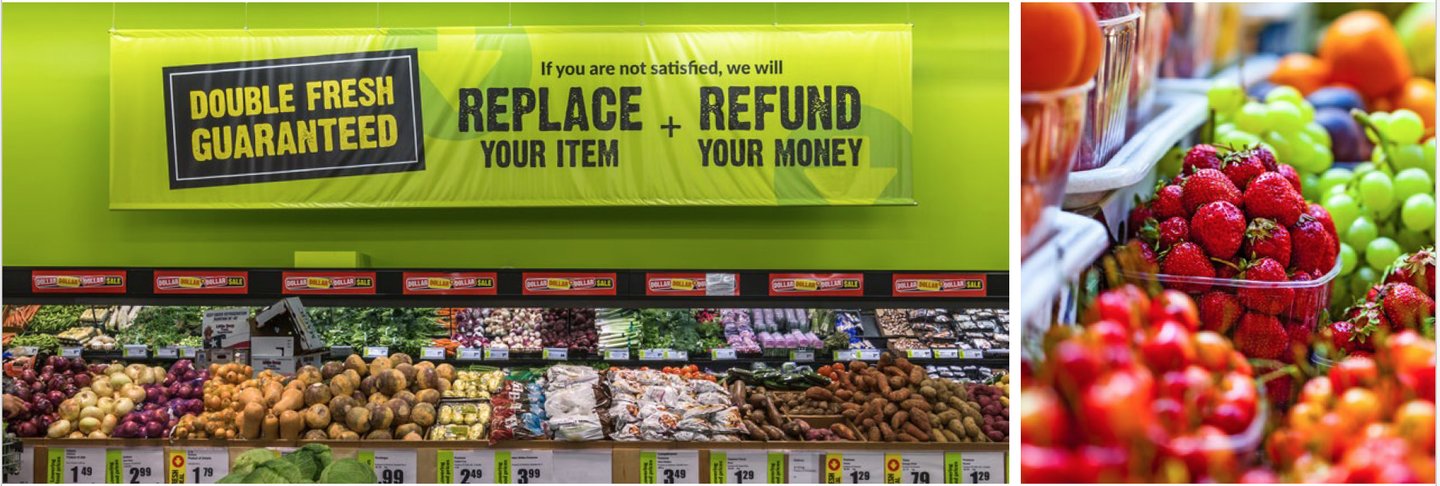
The established color palette was inverted to emphasize the vivid brand lime green versus the black (generally associated with premium products), creating a bold discount-themed look.
To evoke ‘great deals’ excitement and reinforce the low-price experience, a prominent ‘value zone’ was added just beyond the entrance of the store. Key value messages, hung on vinyl banners, along with red, yellow and Freshco’s downward arrow iconography further reinforced the value proposition throughout the shopping journey.