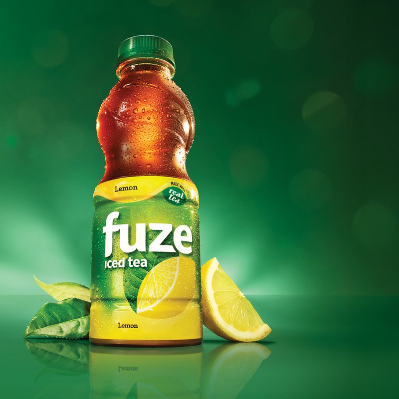
A bottle of Fuze Lemon iced tea with a lemon wedge and tea leaves, lit against a dark green background A bottle of Fuze Lemon iced tea with a lemon wedge and tea leaves, lit against a dark green background

Fuze Iced Tea

Fuze Iced Tea launch in Canada

A design strategy that delivered results.

When Coca-Cola sought to introduce a new sweetened iced tea brand to the Canadian market, they faced a unique challenge. With their previous license to sell an existing brand no longer viable, the company turned to the global success story of Fuze Tea. Already a hit in Europe and Asia, Fuze Tea held immense potential to dominate the Canadian market, but it needed to be tailored to the preferences and expectations of Canadian consumers. Enter Fish, which was brought in to adapt the global brand while ensuring rapid market impact.

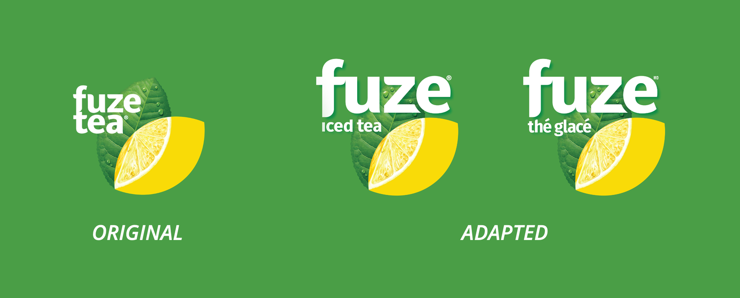
The adapted Fuze iced tea logo: white lettering over a lemon slice and tea leaf on green

The Opportunity

Fuze Tea was positioned to replace the outgoing brand and fill a gap in Canada’s sweetened iced tea category. The goal was ambitious but clear - Fuze Tea needed to resonate strongly with Canadian shoppers and quickly claim the #1 spot in the category. Canadian consumers’ desire for simple, bold, and refreshing flavors would need to inform the design and positioning of the product lineup, which consisted of five iced tea flavors.

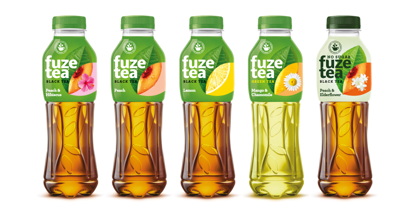
The original Fuze Tea line-up from Bulgaria: five bottles of peach hibiscus, peach, lemon, mango chamomile and peach elderflower black and green teas

LINE-UP FROM BULGARIA

Insight-Driven Design

Understanding the Canadian market was critical and bold moves were required. The design adaptation honored global Fuze Tea standards but included key changes to meet the bilingual and culturally specific demands of Canada. The first strategic decision was to create a “language-agnostic” brand lockup by isolating the Fuze logo and developing separate French and English design elements for the “iced tea” descriptor. The logo’s wordmark was also enlarged to emphasize the Fuze brand and ensure it stood out.

The original Fuze Tea logo beside the adapted Canadian logos, one reading 'iced tea' and one 'the glace', each with a lemon slice and leaf

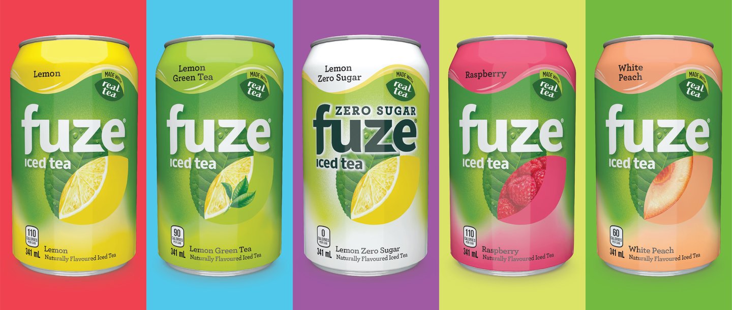
The flavor-forward design became the heart of the strategy. The package highlighted the fusion of real tea and fruit through illustrations that seamlessly tied the two elements together, amplified by a blend of SKU-specific tones with the iconic green of the Fuze brand. By incorporating a vibrant, wavy color band at the top of the label, the design enhanced the sense of refreshment, even when product placement obscured the package’s lower section.

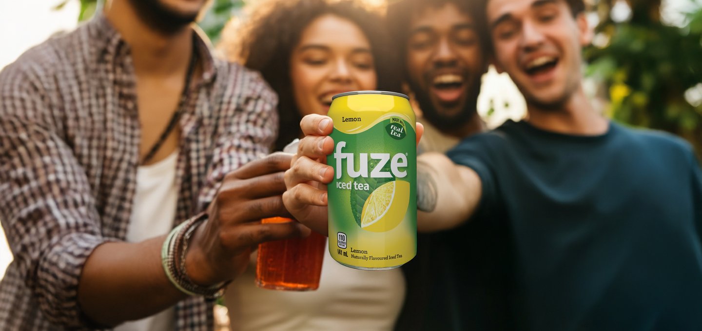
Four friends laughing and raising cans of Fuze iced tea together outdoors Four friends laughing and raising cans of Fuze iced tea together outdoors

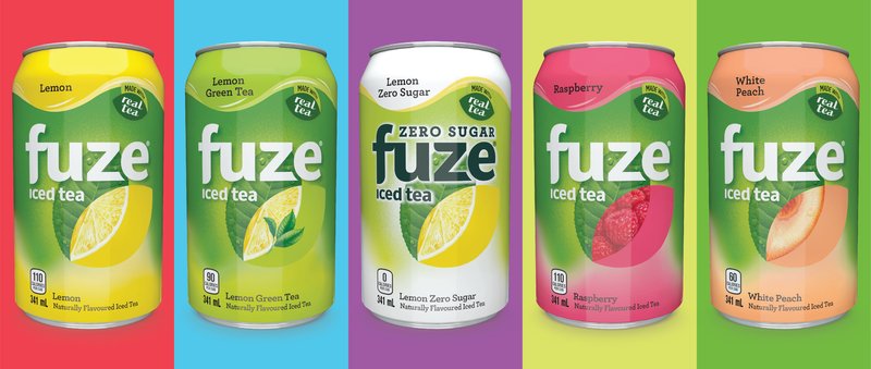
Two Canadian-exclusive SKUs were introduced to cater to local preferences—Zero Sugar and White Peach. Veering from Coca-Cola’s traditional black designs for zero-sugar products, the Zero Sugar SKU adopted a white design to align with Canadian consumer perceptions of “healthier” beverages. This shift underscored the product’s no-sugar credentials without sacrificing alignment with the brand’s bright, bold aesthetic.

Five Fuze iced tea cans on bright colour panels: Lemon, Lemon Green Tea, Lemon Zero Sugar, Raspberry and White Peach Five Fuze iced tea cans on bright colour panels: Lemon, Lemon Green Tea, Lemon Zero Sugar, Raspberry and White Peach

Messaging and Integration

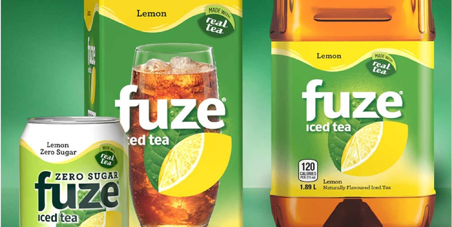
To emphasize Fuze Iced Tea’s core attributes—natural flavor, real tea, and refreshment - a thoughtfully designed “Made with real tea” flash was incorporated, using elements of the Fuze logo as a callout device.

Fuze Lemon iced tea bottle, carton, Zero Sugar can and a full glass, each pack carrying the 'Made with real tea' flash

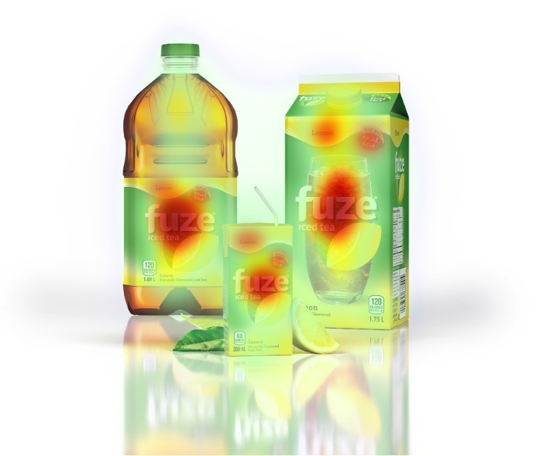
Eye-tracking studies ensured each design element aligned with consumer decision-making priorities, with a visual hierarchy that gave prominence to the brand, flavor, and then the callout message.

An eye-tracking heatmap over Fuze iced tea packaging, glowing where viewers looked first

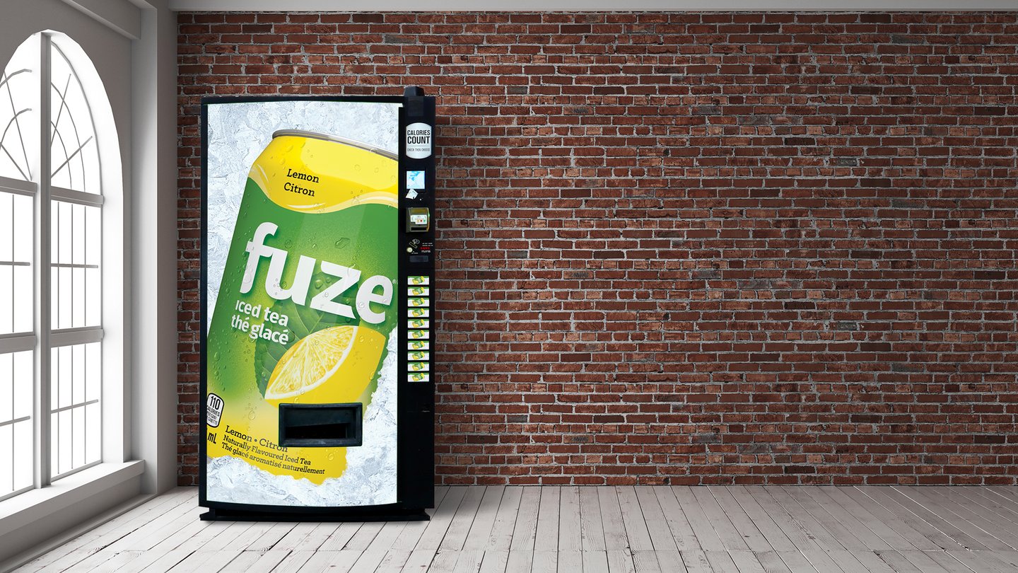
The promotional strategy focused heavily on the lemon flavor SKU, which had the widest distribution. Centering the package as the hero in advertising and in-store displays enhanced consumer recall and preference.

A vending machine wrapped in Fuze Lemon iced tea branding against a brick wall
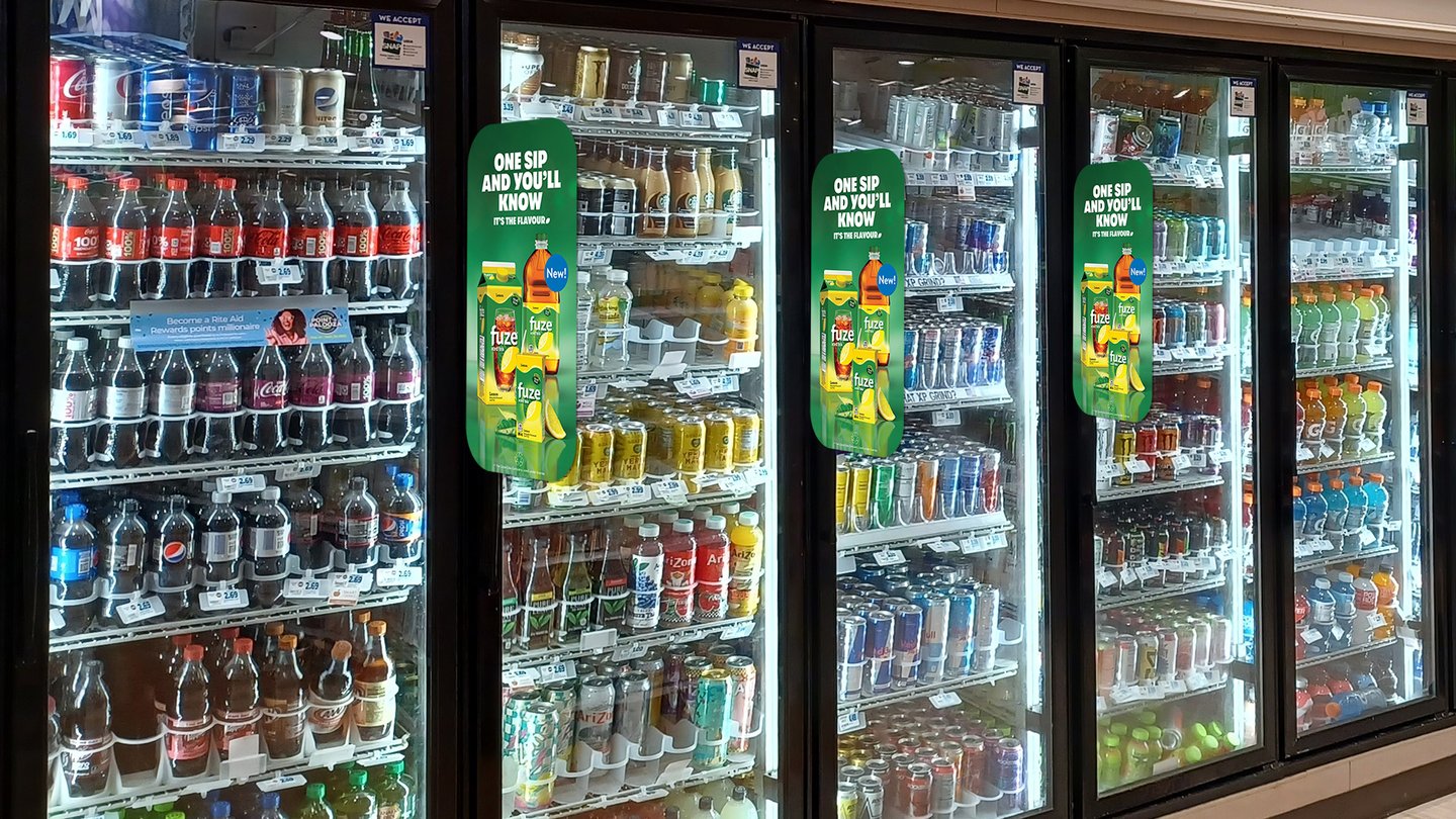
Fuze 'One sip and you'll know' blade signs on the doors of grocery store beverage coolers
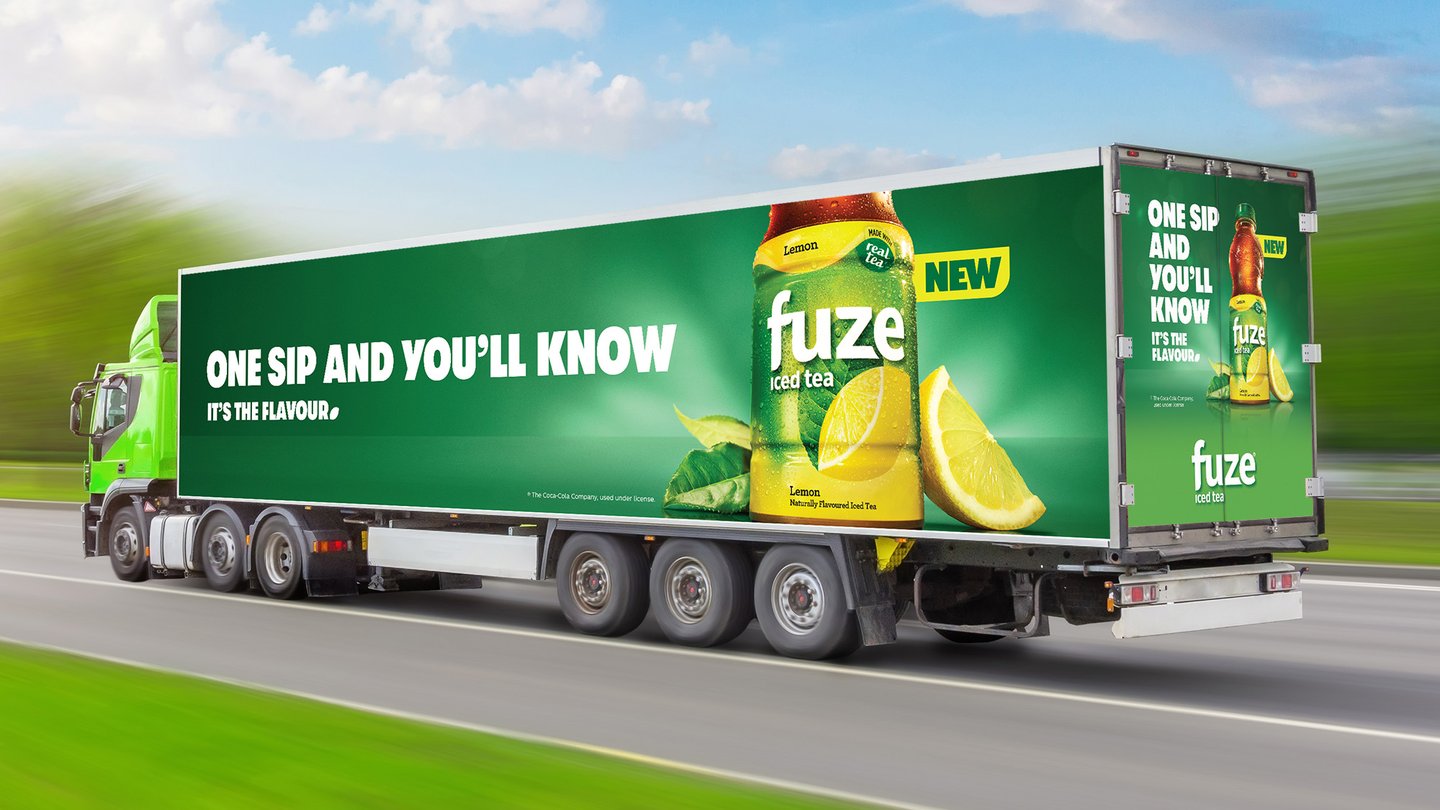
A transport truck wrapped in green Fuze iced tea advertising reading 'One sip and you'll know, it's the flavour' A transport truck wrapped in green Fuze iced tea advertising reading 'One sip and you'll know, it's the flavour'

Results

The strategic adaptation and bold Canadian-focused design propelled Fuze Iced Tea to monumental success. Within just six months of its launch, it claimed the top position in Canada’s sweetened iced tea category, displacing a long-time market leader.

By combining a globally recognized design language with sharp insight into Canadian consumer tastes, Fuze Iced Tea became a showcase for how thoughtful adaptation and brand storytelling can achieve remarkable results in record time.

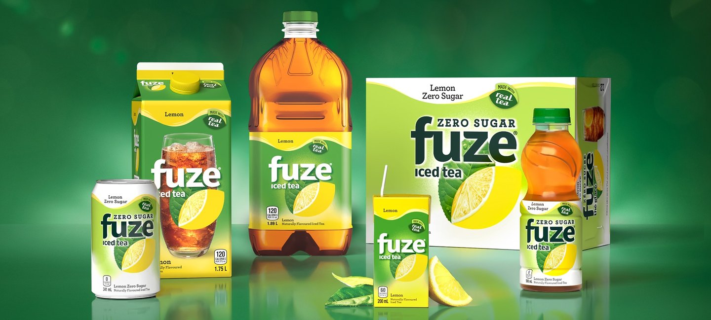
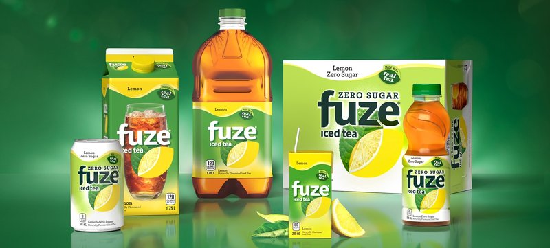
The Fuze iced tea family on green: Zero Sugar can, Lemon carton and bottle, Zero Sugar 12-pack and a 500 ml bottle The Fuze iced tea family on green: Zero Sugar can, Lemon carton and bottle, Zero Sugar 12-pack and a 500 ml bottle