Sprite x Raptors
Celebrating a legacy. Energizing a fanbase.
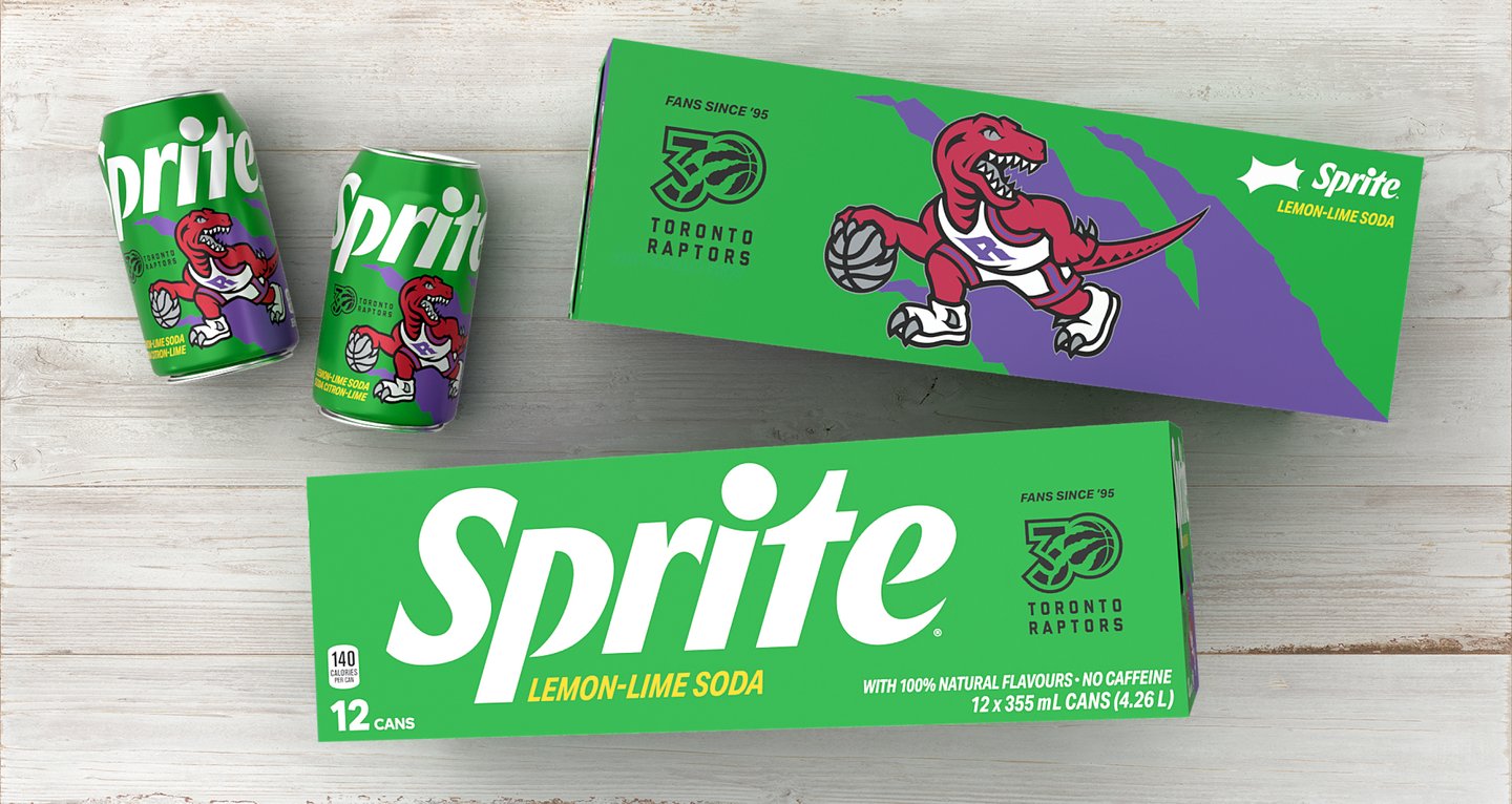
The Raptors 30th anniversary commemorative limited-edition Sprite.

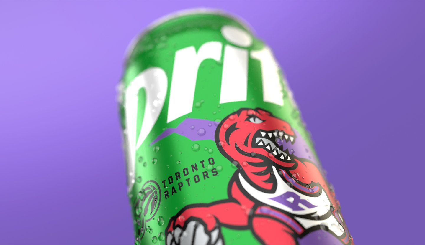
The Raptors 30th anniversary commemorative limited-edition Sprite.
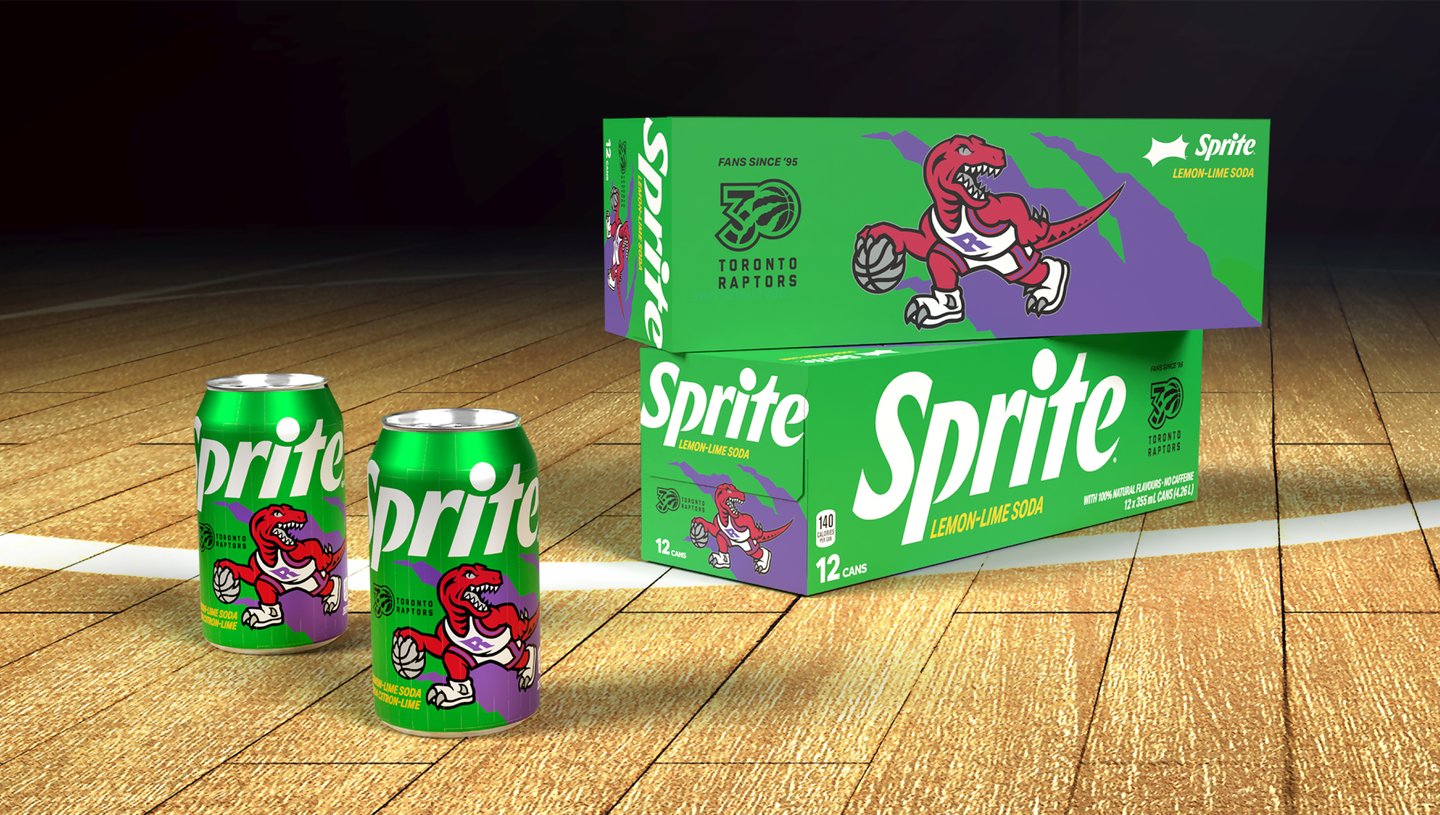
When the Toronto Raptors hit a major milestone, Coca-Cola Canada saw a chance to go beyond traditional branding and tap into the electric energy of Raptors fandom. This wasn’t just about packaging—it was about celebrating a team, a culture, and a city. The goal: create a can that would fire up fans and become an instant collectible.
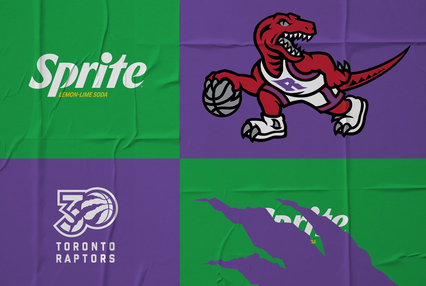
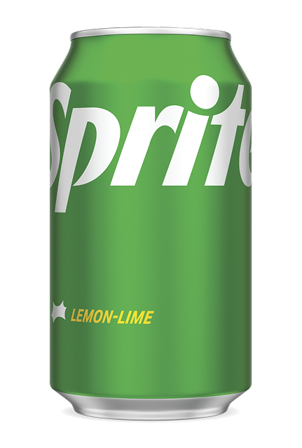
BEFORE
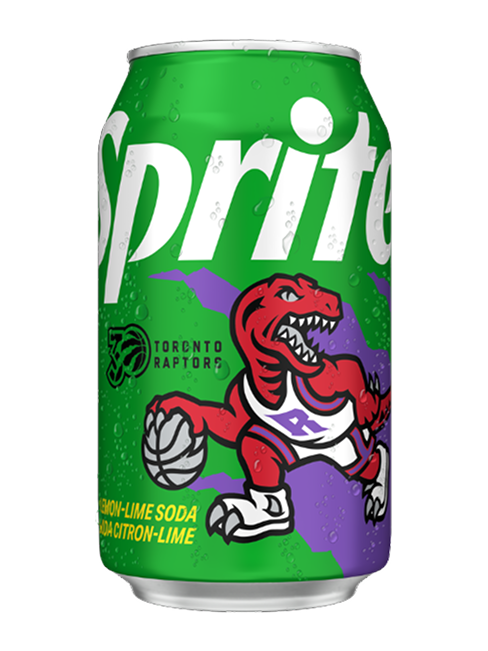
AFTER
Raptors fans don’t just watch the game—they live it. They’re loyal, loud, and proud. By giving them a limited-edition can that celebrated their team with bold design and nostalgic flair, Sprite could offer more than refreshment—it could offer a piece of the Raptors story.
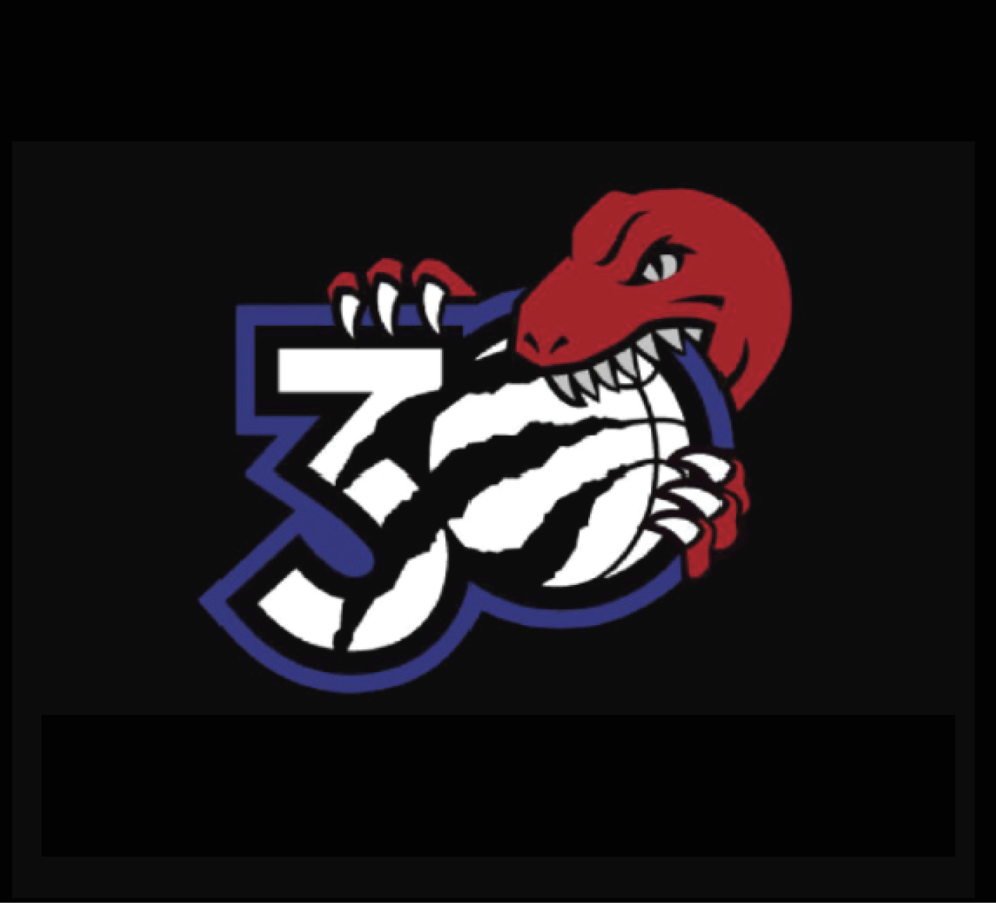
30TH ANNIVERSARY LOGO
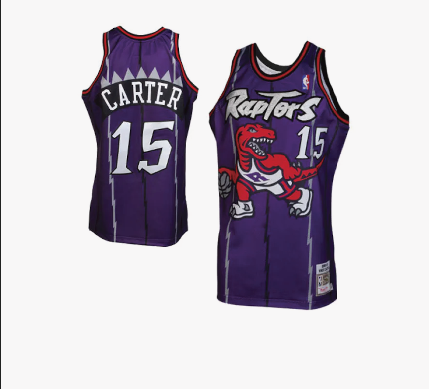
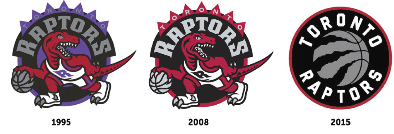
ORIGINAL JERSEY
The challenge was twofold: stay true to Sprite’s iconic brand identity while delivering something that felt bold, fresh, and distinctly Raptors. Our solution was a dynamic, limited-edition design that fused two powerhouse cultures—Sprite’s crisp, refreshing vibe and the Raptors’ fierce, fan-fueled energy.
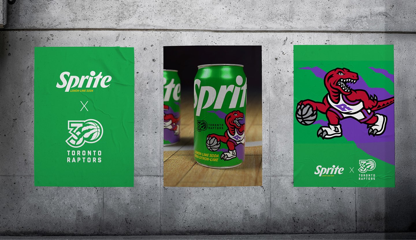
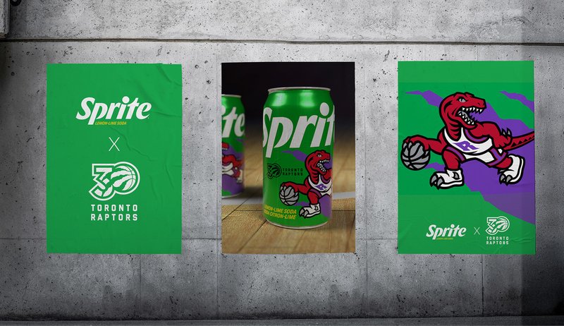
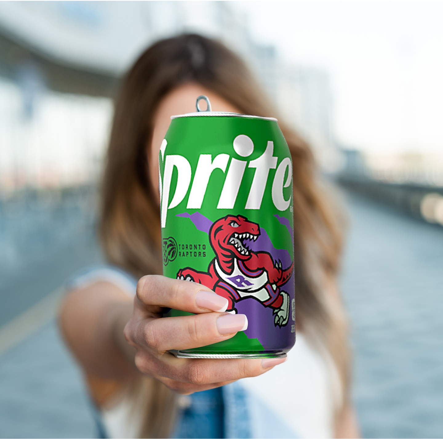
To immediately set the can apart, we introduced a bold new color scheme: vivid red and purple—iconic Raptors tones—layered against Sprite’s signature green. This high-contrast palette created instant shelf impact, drawing attention from a distance and signaling that this wasn’t just another Sprite. It was something special.
The layout balanced clean lines with the high-energy movement fans love about the game. Raptors-inspired graphics and typography paid homage to the team’s past and present, while Sprite’s minimalist branding ensured the design remained authentic to the brand.
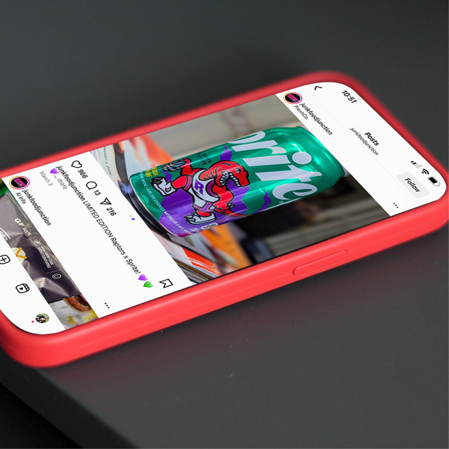
The design sparked instant excitement and nostalgia, driving buzz across the province.
More importantly, it drove fans to stores to grab their piece of Raptors history - the entire limited-edition run sold out.
More than a beverage, it became a badge of pride—a bold tribute to the Raptors, and a powerful reminder of Sprite’s long-standing connection to Canadian basketball culture.